Minimalism
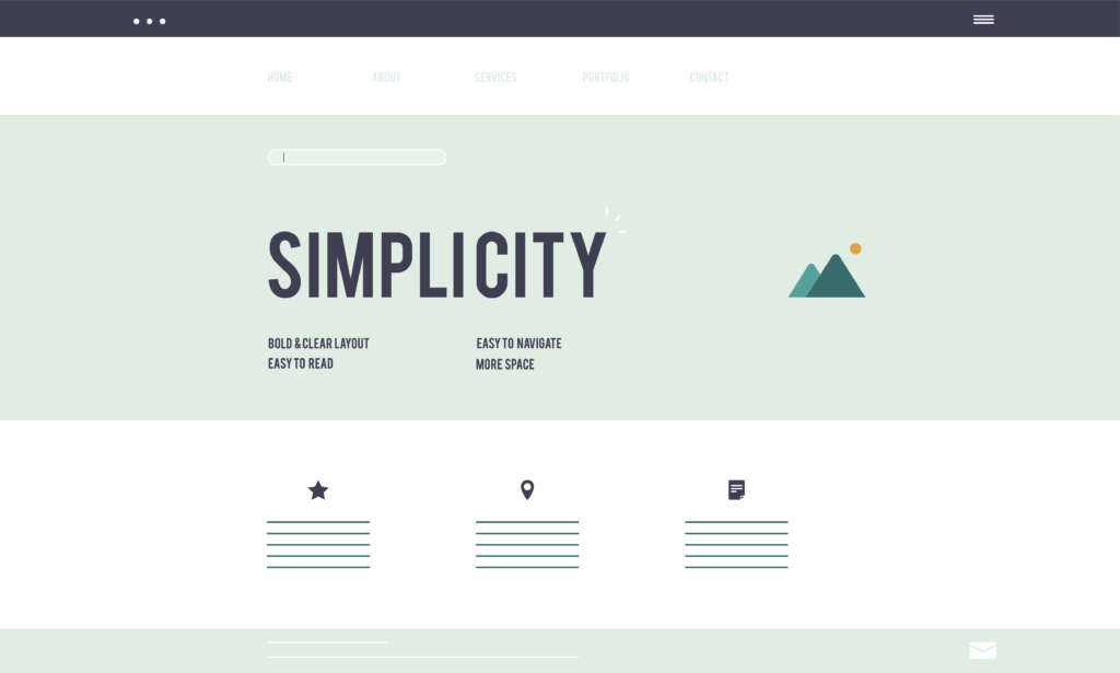
Web designers are still seeing a lot of success with minimalism, a key aspect of website design trends, which is defined by tidy layouts, lots of white space, and understated yet sophisticated aesthetics. Users can experience a simplified and distraction-free website by eliminating extraneous features and emphasising usefulness and clarity. Websites that use a minimalist style include:
- Apple: The company’s website is a prime example of minimalist design, showcasing its products with clear lines, sharp graphics and simple navigation.
- Dropbox: It’s simple to grasp the services and capabilities offered by Dropbox because of its minimalist website design, which places an emphasis on clarity and ease of usage.
Bold Typography
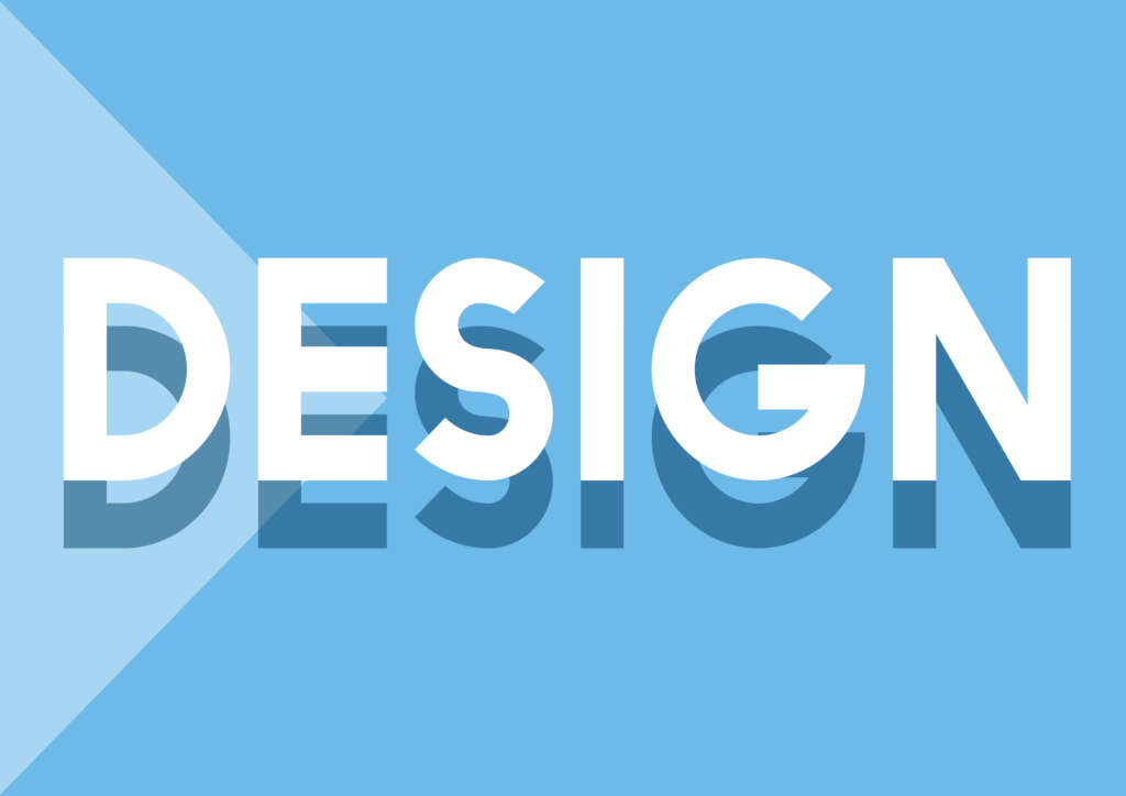
Bold typography has become a powerful design feature in web page design trends, enabling websites to express their personality and make a statement solely with their font. Bold typography improves readability and creates visual interest in a variety of ways, from large headings to creative font combinations. The following are some instances of websites that use bold typography:
- Medium: To highlight article headlines and provide readers with an eye-catching reading experience, Medium employs bold typography on its website.
- Spotify: To accentuate important features and call-to-action buttons, the company uses strong typography on its website, which exudes enthusiasm and energy.
Micro-Interactions
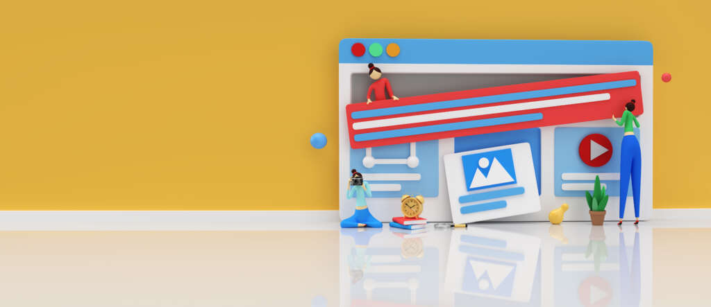
micro-interactions. Micro-interactions, such as loading indicators, button animations and hover effects, give websites a more dynamic and unique feel. The following are some instances of websites that use micro-interactions:
- Airbnb: To create a smooth and simple browsing experience, Airbnb uses micro-interactions on its website to give feedback as visitors engage with search criteria or linger over property listings.
- Google: The search engine has micro-interactions that improve usability and delight users with small animations, like animated loading bars and hover effects.
Dark Mode
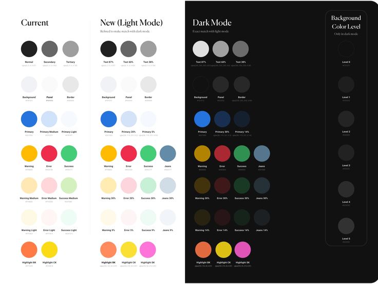
As people look for other colour schemes that are easier on the eyes, save battery life and convey a sense of sophistication, dark mode has become more and more popular. Dark mode interfaces give off a clean, contemporary look by having dark backgrounds with light text and accents. Websites that have adopted dark mode include:
- YouTube: Users can have a more immersive viewing experience with YouTube’s dark mode option, which offers a deeper colour scheme to lessen eye strain in low light.
- Reddit: As an eye-catching contrast to its standard light mode, Reddit’s dark mode interface has a dark background with contrasting text and accents.


